Visualization
Visualizing BERTopic and its derivatives is important in understanding the model, how it works, and more importantly, where it works. Since topic modeling can be quite a subjective field it is difficult for users to validate their models. Looking at the topics and seeing if they make sense is an important factor in alleviating this issue.
Visualize Topics
After having trained our BERTopic model, we can iteratively go through hundreds of topics to get a good
understanding of the topics that were extracted. However, that takes quite some time and lacks a global representation.
Instead, we can visualize the topics that were generated in a way very similar to
LDAvis.
We embed our c-TF-IDF representation of the topics in 2D using Umap and then visualize the two dimensions using plotly such that we can create an interactive view.
First, we need to train our model:
from bertopic import BERTopic
from sklearn.datasets import fetch_20newsgroups

docs = fetch_20newsgroups(subset='all',  remove=('headers', 'footers', 'quotes'))['data']
topic_model = BERTopic()
topics, probs = topic_model.fit_transform(docs)
Then, we can call .visualize_topics to create a 2D representation of your topics. The resulting graph is a
plotly interactive graph which can be converted to HTML:
topic_model.visualize_topics()
You can use the slider to select the topic which then lights up red. If you hover over a topic, then general information is given about the topic, including the size of the topic and its corresponding words.
Visualize Documents
Using the previous method, we can visualize the topics and get insight into their relationships. However,
you might want a more fine-grained approach where we can visualize the documents inside the topics to see
if they were assigned correctly or whether they make sense. To do so, we can use the topic_model.visualize_documents()
function. This function recalculates the document embeddings and reduces them to 2-dimensional space for easier visualization
purposes. This process can be quite expensive, so it is advised to adhere to the following pipeline:
from sklearn.datasets import fetch_20newsgroups
from sentence_transformers import SentenceTransformer
from bertopic import BERTopic
from umap import UMAP

# Prepare embeddings
docs = fetch_20newsgroups(subset='all',  remove=('headers', 'footers', 'quotes'))['data']
sentence_model = SentenceTransformer("all-MiniLM-L6-v2")
embeddings = sentence_model.encode(docs, show_progress_bar=False)

# Train BERTopic
topic_model = BERTopic().fit(docs, embeddings)

# Run the visualization with the original embeddings
topic_model.visualize_documents(docs, embeddings=embeddings)

# Reduce dimensionality of embeddings, this step is optional but much faster to perform iteratively:
reduced_embeddings = UMAP(n_neighbors=10, n_components=2, min_dist=0.0, metric='cosine').fit_transform(embeddings)
topic_model.visualize_documents(docs, reduced_embeddings=reduced_embeddings)
Note
The visualization above was generated with the additional parameter hide_document_hover=True which disables the
option to hover over the individual points and see the content of the documents. This was done for demonstration purposes
as saving all those documents in the visualization can be quite expensive and result in large files. However,
it might be interesting to set hide_document_hover=False in order to hover over the points and see the content of the documents.
Custom Hover
When you visualize the documents, you might not always want to see the complete document over hover. Many documents have shorter information that might be more interesting to visualize, such as its title. To create the hover based on a documents' title instead of its content, you can simply pass a variable (titles) containing the title for each document:
topic_model.visualize_documents(titles, reduced_embeddings=reduced_embeddings)
Visualize Topic Hierarchy
The topics that were created can be hierarchically reduced. In order to understand the potential hierarchical
structure of the topics, we can use scipy.cluster.hierarchy to create clusters and visualize how
they relate to one another. This might help to select an appropriate nr_topics when reducing the number
of topics that you have created. To visualize this hierarchy, run the following:
topic_model.visualize_hierarchy()
Note
Do note that this is not the actual procedure of .reduce_topics() when nr_topics is set to
auto since HDBSCAN is used to automatically extract topics. The visualization above closely resembles
the actual procedure of .reduce_topics() when any number of nr_topics is selected.
Hierarchical labels
Although visualizing this hierarchy gives us information about the structure, it would be helpful to see what happens to the topic representations when merging topics. To do so, we first need to calculate the representations of the hierarchical topics:
First, we train a basic BERTopic model:
from bertopic import BERTopic
from sklearn.datasets import fetch_20newsgroups

docs = fetch_20newsgroups(subset='all',  remove=('headers', 'footers', 'quotes'))["data"]
topic_model = BERTopic(verbose=True)
topics, probs = topic_model.fit_transform(docs)
hierarchical_topics = topic_model.hierarchical_topics(docs)
To visualize these results, we simply need to pass the resulting hierarchical_topics to our .visualize_hierarchy function:
topic_model.visualize_hierarchy(hierarchical_topics=hierarchical_topics)
If you hover over the black circles, you will see the topic representation at that level of the hierarchy. These representations help you understand the effect of merging certain topics. Some might be logical to merge whilst others might not. Moreover, we can now see which sub-topics can be found within certain larger themes.
Text-based topic tree
Although this gives a nice overview of the potential hierarchy, hovering over all black circles can be tiresome. Instead, we can
use topic_model.get_topic_tree to create a text-based representation of this hierarchy. Although the general structure is more difficult
to view, we can see better which topics could be logically merged:
>>> tree = topic_model.get_topic_tree(hierarchical_topics)
>>> print(tree)
.
└─atheists_atheism_god_moral_atheist
     ├─atheists_atheism_god_atheist_argument
     │    ├─■──atheists_atheism_god_atheist_argument ── Topic: 21
     │    └─■──br_god_exist_genetic_existence ── Topic: 124
     └─■──moral_morality_objective_immoral_morals ── Topic: 29
Click here to view the full tree.
.
├─people_armenian_said_god_armenians
│ ├─god_jesus_jehovah_lord_christ
│ │ ├─god_jesus_jehovah_lord_christ
│ │ │ ├─jehovah_lord_mormon_mcconkie_god
│ │ │ │ ├─■──ra_satan_thou_god_lucifer ── Topic: 94
│ │ │ │ └─■──jehovah_lord_mormon_mcconkie_unto ── Topic: 78
│ │ │ └─jesus_mary_god_hell_sin
│ │ │ ├─jesus_hell_god_eternal_heaven
│ │ │ │ ├─hell_jesus_eternal_god_heaven
│ │ │ │ │ ├─■──jesus_tomb_disciples_resurrection_john ── Topic: 69
│ │ │ │ │ └─■──hell_eternal_god_jesus_heaven ── Topic: 53
│ │ │ │ └─■──aaron_baptism_sin_law_god ── Topic: 89
│ │ │ └─■──mary_sin_maria_priest_conception ── Topic: 56
│ │ └─■──marriage_married_marry_ceremony_marriages ── Topic: 110
│ └─people_armenian_armenians_said_mr
│ ├─people_armenian_armenians_said_israel
│ │ ├─god_homosexual_homosexuality_atheists_sex
│ │ │ ├─homosexual_homosexuality_sex_gay_homosexuals
│ │ │ │ ├─■──kinsey_sex_gay_men_sexual ── Topic: 44
│ │ │ │ └─homosexuality_homosexual_sin_homosexuals_gay
│ │ │ │ ├─■──gay_homosexual_homosexuals_sexual_cramer ── Topic: 50
│ │ │ │ └─■──homosexuality_homosexual_sin_paul_sex ── Topic: 27
│ │ │ └─god_atheists_atheism_moral_atheist
│ │ │ ├─islam_quran_judas_islamic_book
│ │ │ │ ├─■──jim_context_challenges_articles_quote ── Topic: 36
│ │ │ │ └─islam_quran_judas_islamic_book
│ │ │ │ ├─■──islam_quran_islamic_rushdie_muslims ── Topic: 31
│ │ │ │ └─■──judas_scripture_bible_books_greek ── Topic: 33
│ │ │ └─atheists_atheism_god_moral_atheist
│ │ │ ├─atheists_atheism_god_atheist_argument
│ │ │ │ ├─■──atheists_atheism_god_atheist_argument ── Topic: 21
│ │ │ │ └─■──br_god_exist_genetic_existence ── Topic: 124
│ │ │ └─■──moral_morality_objective_immoral_morals ── Topic: 29
│ │ └─armenian_armenians_people_israel_said
│ │ ├─armenian_armenians_israel_people_jews
│ │ │ ├─tax_rights_government_income_taxes
│ │ │ │ ├─■──rights_right_slavery_slaves_residence ── Topic: 106
│ │ │ │ └─tax_government_taxes_income_libertarians
│ │ │ │ ├─■──government_libertarians_libertarian_regulation_party ── Topic: 58
│ │ │ │ └─■──tax_taxes_income_billion_deficit ── Topic: 41
│ │ │ └─armenian_armenians_israel_people_jews
│ │ │ ├─gun_guns_militia_firearms_amendment
│ │ │ │ ├─■──blacks_penalty_death_cruel_punishment ── Topic: 55
│ │ │ │ └─■──gun_guns_militia_firearms_amendment ── Topic: 7
│ │ │ └─armenian_armenians_israel_jews_turkish
│ │ │ ├─■──israel_israeli_jews_arab_jewish ── Topic: 4
│ │ │ └─■──armenian_armenians_turkish_armenia_azerbaijan ── Topic: 15
│ │ └─stephanopoulos_president_mr_myers_ms
│ │ ├─■──serbs_muslims_stephanopoulos_mr_bosnia ── Topic: 35
│ │ └─■──myers_stephanopoulos_president_ms_mr ── Topic: 87
│ └─batf_fbi_koresh_compound_gas
│ ├─■──reno_workers_janet_clinton_waco ── Topic: 77
│ └─batf_fbi_koresh_gas_compound
│ ├─batf_koresh_fbi_warrant_compound
│ │ ├─■──batf_warrant_raid_compound_fbi ── Topic: 42
│ │ └─■──koresh_batf_fbi_children_compound ── Topic: 61
│ └─■──fbi_gas_tear_bds_building ── Topic: 23
└─use_like_just_dont_new
├─game_team_year_games_like
│ ├─game_team_games_25_year
│ │ ├─game_team_games_25_season
│ │ │ ├─window_printer_use_problem_mhz
│ │ │ │ ├─mhz_wire_simms_wiring_battery
│ │ │ │ │ ├─simms_mhz_battery_cpu_heat
│ │ │ │ │ │ ├─simms_pds_simm_vram_lc
│ │ │ │ │ │ │ ├─■──pds_nubus_lc_slot_card ── Topic: 119
│ │ │ │ │ │ │ └─■──simms_simm_vram_meg_dram ── Topic: 32
│ │ │ │ │ │ └─mhz_battery_cpu_heat_speed
│ │ │ │ │ │ ├─mhz_cpu_speed_heat_fan
│ │ │ │ │ │ │ ├─mhz_cpu_speed_heat_fan
│ │ │ │ │ │ │ │ ├─■──fan_cpu_heat_sink_fans ── Topic: 92
│ │ │ │ │ │ │ │ └─■──mhz_speed_cpu_fpu_clock ── Topic: 22
│ │ │ │ │ │ │ └─■──monitor_turn_power_computer_electricity ── Topic: 91
│ │ │ │ │ │ └─battery_batteries_concrete_duo_discharge
│ │ │ │ │ │ ├─■──duo_battery_apple_230_problem ── Topic: 121
│ │ │ │ │ │ └─■──battery_batteries_concrete_discharge_temperature ── Topic: 75
│ │ │ │ │ └─wire_wiring_ground_neutral_outlets
│ │ │ │ │ ├─wire_wiring_ground_neutral_outlets
│ │ │ │ │ │ ├─wire_wiring_ground_neutral_outlets
│ │ │ │ │ │ │ ├─■──leds_uv_blue_light_boards ── Topic: 66
│ │ │ │ │ │ │ └─■──wire_wiring_ground_neutral_outlets ── Topic: 120
│ │ │ │ │ │ └─scope_scopes_phone_dial_number
│ │ │ │ │ │ ├─■──dial_number_phone_line_output ── Topic: 93
│ │ │ │ │ │ └─■──scope_scopes_motorola_generator_oscilloscope ── Topic: 113
│ │ │ │ │ └─celp_dsp_sampling_antenna_digital
│ │ │ │ │ ├─■──antenna_antennas_receiver_cable_transmitter ── Topic: 70
│ │ │ │ │ └─■──celp_dsp_sampling_speech_voice ── Topic: 52
│ │ │ │ └─window_printer_xv_mouse_windows
│ │ │ │ ├─window_xv_error_widget_problem
│ │ │ │ │ ├─error_symbol_undefined_xterm_rx
│ │ │ │ │ │ ├─■──symbol_error_undefined_doug_parse ── Topic: 63
│ │ │ │ │ │ └─■──rx_remote_server_xdm_xterm ── Topic: 45
│ │ │ │ │ └─window_xv_widget_application_expose
│ │ │ │ │ ├─window_widget_expose_application_event
│ │ │ │ │ │ ├─■──gc_mydisplay_draw_gxxor_drawing ── Topic: 103
│ │ │ │ │ │ └─■──window_widget_application_expose_event ── Topic: 25
│ │ │ │ │ └─xv_den_polygon_points_algorithm
│ │ │ │ │ ├─■──den_polygon_points_algorithm_polygons ── Topic: 28
│ │ │ │ │ └─■──xv_24bit_image_bit_images ── Topic: 57
│ │ │ │ └─printer_fonts_print_mouse_postscript
│ │ │ │ ├─printer_fonts_print_font_deskjet
│ │ │ │ │ ├─■──scanner_logitech_grayscale_ocr_scanman ── Topic: 108
│ │ │ │ │ └─printer_fonts_print_font_deskjet
│ │ │ │ │ ├─■──printer_print_deskjet_hp_ink ── Topic: 18
│ │ │ │ │ └─■──fonts_font_truetype_tt_atm ── Topic: 49
│ │ │ │ └─mouse_ghostscript_midi_driver_postscript
│ │ │ │ ├─ghostscript_midi_postscript_files_file
│ │ │ │ │ ├─■──ghostscript_postscript_pageview_ghostview_dsc ── Topic: 104
│ │ │ │ │ └─midi_sound_file_windows_driver
│ │ │ │ │ ├─■──location_mar_file_host_rwrr ── Topic: 83
│ │ │ │ │ └─■──midi_sound_driver_blaster_soundblaster ── Topic: 98
│ │ │ │ └─■──mouse_driver_mice_ball_problem ── Topic: 68
│ │ │ └─game_team_games_25_season
│ │ │ ├─1st_sale_condition_comics_hulk
│ │ │ │ ├─sale_condition_offer_asking_cd
│ │ │ │ │ ├─condition_stereo_amp_speakers_asking
│ │ │ │ │ │ ├─■──miles_car_amfm_toyota_cassette ── Topic: 62
│ │ │ │ │ │ └─■──amp_speakers_condition_stereo_audio ── Topic: 24
│ │ │ │ │ └─games_sale_pom_cds_shipping
│ │ │ │ │ ├─pom_cds_sale_shipping_cd
│ │ │ │ │ │ ├─■──size_shipping_sale_condition_mattress ── Topic: 100
│ │ │ │ │ │ └─■──pom_cds_cd_sale_picture ── Topic: 37
│ │ │ │ │ └─■──games_game_snes_sega_genesis ── Topic: 40
│ │ │ │ └─1st_hulk_comics_art_appears
│ │ │ │ ├─1st_hulk_comics_art_appears
│ │ │ │ │ ├─lens_tape_camera_backup_lenses
│ │ │ │ │ │ ├─■──tape_backup_tapes_drive_4mm ── Topic: 107
│ │ │ │ │ │ └─■──lens_camera_lenses_zoom_pouch ── Topic: 114
│ │ │ │ │ └─1st_hulk_comics_art_appears
│ │ │ │ │ ├─■──1st_hulk_comics_art_appears ── Topic: 105
│ │ │ │ │ └─■──books_book_cover_trek_chemistry ── Topic: 125
│ │ │ │ └─tickets_hotel_ticket_voucher_package
│ │ │ │ ├─■──hotel_voucher_package_vacation_room ── Topic: 74
│ │ │ │ └─■──tickets_ticket_june_airlines_july ── Topic: 84
│ │ │ └─game_team_games_season_hockey
│ │ │ ├─game_hockey_team_25_550
│ │ │ │ ├─■──espn_pt_pts_game_la ── Topic: 17
│ │ │ │ └─■──team_25_game_hockey_550 ── Topic: 2
│ │ │ └─■──year_game_hit_baseball_players ── Topic: 0
│ │ └─bike_car_greek_insurance_msg
│ │ ├─car_bike_insurance_cars_engine
│ │ │ ├─car_insurance_cars_radar_engine
│ │ │ │ ├─insurance_health_private_care_canada
│ │ │ │ │ ├─■──insurance_health_private_care_canada ── Topic: 99
│ │ │ │ │ └─■──insurance_car_accident_rates_sue ── Topic: 82
│ │ │ │ └─car_cars_radar_engine_detector
│ │ │ │ ├─car_radar_cars_detector_engine
│ │ │ │ │ ├─■──radar_detector_detectors_ka_alarm ── Topic: 39
│ │ │ │ │ └─car_cars_mustang_ford_engine
│ │ │ │ │ ├─■──clutch_shift_shifting_transmission_gear ── Topic: 88
│ │ │ │ │ └─■──car_cars_mustang_ford_v8 ── Topic: 14
│ │ │ │ └─oil_diesel_odometer_diesels_car
│ │ │ │ ├─odometer_oil_sensor_car_drain
│ │ │ │ │ ├─■──odometer_sensor_speedo_gauge_mileage ── Topic: 96
│ │ │ │ │ └─■──oil_drain_car_leaks_taillights ── Topic: 102
│ │ │ │ └─■──diesel_diesels_emissions_fuel_oil ── Topic: 79
│ │ │ └─bike_riding_ride_bikes_motorcycle
│ │ │ ├─bike_ride_riding_bikes_lane
│ │ │ │ ├─■──bike_ride_riding_lane_car ── Topic: 11
│ │ │ │ └─■──bike_bikes_miles_honda_motorcycle ── Topic: 19
│ │ │ └─■──countersteering_bike_motorcycle_rear_shaft ── Topic: 46
│ │ └─greek_msg_kuwait_greece_water
│ │ ├─greek_msg_kuwait_greece_water
│ │ │ ├─greek_msg_kuwait_greece_dog
│ │ │ │ ├─greek_msg_kuwait_greece_dog
│ │ │ │ │ ├─greek_kuwait_greece_turkish_greeks
│ │ │ │ │ │ ├─■──greek_greece_turkish_greeks_cyprus ── Topic: 71
│ │ │ │ │ │ └─■──kuwait_iraq_iran_gulf_arabia ── Topic: 76
│ │ │ │ │ └─msg_dog_drugs_drug_food
│ │ │ │ │ ├─dog_dogs_cooper_trial_weaver
│ │ │ │ │ │ ├─■──clinton_bush_quayle_reagan_panicking ── Topic: 101
│ │ │ │ │ │ └─dog_dogs_cooper_trial_weaver
│ │ │ │ │ │ ├─■──cooper_trial_weaver_spence_witnesses ── Topic: 90
│ │ │ │ │ │ └─■──dog_dogs_bike_trained_springer ── Topic: 67
│ │ │ │ │ └─msg_drugs_drug_food_chinese
│ │ │ │ │ ├─■──msg_food_chinese_foods_taste ── Topic: 30
│ │ │ │ │ └─■──drugs_drug_marijuana_cocaine_alcohol ── Topic: 72
│ │ │ │ └─water_theory_universe_science_larsons
│ │ │ │ ├─water_nuclear_cooling_steam_dept
│ │ │ │ │ ├─■──rocketry_rockets_engines_nuclear_plutonium ── Topic: 115
│ │ │ │ │ └─water_cooling_steam_dept_plants
│ │ │ │ │ ├─■──water_dept_phd_environmental_atmospheric ── Topic: 97
│ │ │ │ │ └─■──cooling_water_steam_towers_plants ── Topic: 109
│ │ │ │ └─theory_universe_larsons_larson_science
│ │ │ │ ├─■──theory_universe_larsons_larson_science ── Topic: 54
│ │ │ │ └─■──oort_cloud_grbs_gamma_burst ── Topic: 80
│ │ │ └─helmet_kirlian_photography_lock_wax
│ │ │ ├─helmet_kirlian_photography_leaf_mask
│ │ │ │ ├─kirlian_photography_leaf_pictures_deleted
│ │ │ │ │ ├─deleted_joke_stuff_maddi_nickname
│ │ │ │ │ │ ├─■──joke_maddi_nickname_nicknames_frank ── Topic: 43
│ │ │ │ │ │ └─■──deleted_stuff_bookstore_joke_motto ── Topic: 81
│ │ │ │ │ └─■──kirlian_photography_leaf_pictures_aura ── Topic: 85
│ │ │ │ └─helmet_mask_liner_foam_cb
│ │ │ │ ├─■──helmet_liner_foam_cb_helmets ── Topic: 112
│ │ │ │ └─■──mask_goalies_77_santore_tl ── Topic: 123
│ │ │ └─lock_wax_paint_plastic_ear
│ │ │ ├─■──lock_cable_locks_bike_600 ── Topic: 117
│ │ │ └─wax_paint_ear_plastic_skin
│ │ │ ├─■──wax_paint_plastic_scratches_solvent ── Topic: 65
│ │ │ └─■──ear_wax_skin_greasy_acne ── Topic: 116
│ │ └─m4_mp_14_mw_mo
│ │ ├─m4_mp_14_mw_mo
│ │ │ ├─■──m4_mp_14_mw_mo ── Topic: 111
│ │ │ └─■──test_ensign_nameless_deane_deanebinahccbrandeisedu ── Topic: 118
│ │ └─■──ites_cheek_hello_hi_ken ── Topic: 3
│ └─space_medical_health_disease_cancer
│ ├─medical_health_disease_cancer_patients
│ │ ├─■──cancer_centers_center_medical_research ── Topic: 122
│ │ └─health_medical_disease_patients_hiv
│ │ ├─patients_medical_disease_candida_health
│ │ │ ├─■──candida_yeast_infection_gonorrhea_infections ── Topic: 48
│ │ │ └─patients_disease_cancer_medical_doctor
│ │ │ ├─■──hiv_medical_cancer_patients_doctor ── Topic: 34
│ │ │ └─■──pain_drug_patients_disease_diet ── Topic: 26
│ │ └─■──health_newsgroup_tobacco_vote_votes ── Topic: 9
│ └─space_launch_nasa_shuttle_orbit
│ ├─space_moon_station_nasa_launch
│ │ ├─■──sky_advertising_billboard_billboards_space ── Topic: 59
│ │ └─■──space_station_moon_redesign_nasa ── Topic: 16
│ └─space_mission_hst_launch_orbit
│ ├─space_launch_nasa_orbit_propulsion
│ │ ├─■──space_launch_nasa_propulsion_astronaut ── Topic: 47
│ │ └─■──orbit_km_jupiter_probe_earth ── Topic: 86
│ └─■──hst_mission_shuttle_orbit_arrays ── Topic: 60
└─drive_file_key_windows_use
├─key_file_jpeg_encryption_image
│ ├─key_encryption_clipper_chip_keys
│ │ ├─■──key_clipper_encryption_chip_keys ── Topic: 1
│ │ └─■──entry_file_ripem_entries_key ── Topic: 73
│ └─jpeg_image_file_gif_images
│ ├─motif_graphics_ftp_available_3d
│ │ ├─motif_graphics_openwindows_ftp_available
│ │ │ ├─■──openwindows_motif_xview_windows_mouse ── Topic: 20
│ │ │ └─■──graphics_widget_ray_3d_available ── Topic: 95
│ │ └─■──3d_machines_version_comments_contact ── Topic: 38
│ └─jpeg_image_gif_images_format
│ ├─■──gopher_ftp_files_stuffit_images ── Topic: 51
│ └─■──jpeg_image_gif_format_images ── Topic: 13
└─drive_db_card_scsi_windows
├─db_windows_dos_mov_os2
│ ├─■──copy_protection_program_software_disk ── Topic: 64
│ └─■──db_windows_dos_mov_os2 ── Topic: 8
└─drive_card_scsi_drives_ide
├─drive_scsi_drives_ide_disk
│ ├─■──drive_scsi_drives_ide_disk ── Topic: 6
│ └─■──meg_sale_ram_drive_shipping ── Topic: 12
└─card_modem_monitor_video_drivers
├─■──card_monitor_video_drivers_vga ── Topic: 5
└─■──modem_port_serial_irq_com ── Topic: 10
Visualize Hierarchical Documents
We can extend the previous method by calculating the topic representation at different levels of the hierarchy and plotting them on a 2D plane. To do so, we first need to calculate the hierarchical topics:
from sklearn.datasets import fetch_20newsgroups
from sentence_transformers import SentenceTransformer
from bertopic import BERTopic
from umap import UMAP

# Prepare embeddings
docs = fetch_20newsgroups(subset='all',  remove=('headers', 'footers', 'quotes'))['data']
sentence_model = SentenceTransformer("all-MiniLM-L6-v2")
embeddings = sentence_model.encode(docs, show_progress_bar=False)

# Train BERTopic and extract hierarchical topics
topic_model = BERTopic().fit(docs, embeddings)
hierarchical_topics = topic_model.hierarchical_topics(docs)
# Run the visualization with the original embeddings
topic_model.visualize_hierarchical_documents(docs, hierarchical_topics, embeddings=embeddings)

# Reduce dimensionality of embeddings, this step is optional but much faster to perform iteratively:
reduced_embeddings = UMAP(n_neighbors=10, n_components=2, min_dist=0.0, metric='cosine').fit_transform(embeddings)
topic_model.visualize_hierarchical_documents(docs, hierarchical_topics, reduced_embeddings=reduced_embeddings)
Note
The visualization above was generated with the additional parameter hide_document_hover=True which disables the
option to hover over the individual points and see the content of the documents. This makes the resulting visualization
smaller and fit into your RAM. However, it might be interesting to set hide_document_hover=False to hover
over the points and see the content of the documents.
Visualize Terms
We can visualize the selected terms for a few topics by creating bar charts out of the c-TF-IDF scores for each topic representation. Insights can be gained from the relative c-TF-IDF scores between and within topics. Moreover, you can easily compare topic representations to each other. To visualize this hierarchy, run the following:
topic_model.visualize_barchart()
Visualize Topic Similarity
Having generated topic embeddings, through both c-TF-IDF and embeddings, we can create a similarity matrix by simply applying cosine similarities through those topic embeddings. The result will be a matrix indicating how similar certain topics are to each other. To visualize the heatmap, run the following:
topic_model.visualize_heatmap()
Note
You can set n_clusters in visualize_heatmap to order the topics by their similarity.
This will result in blocks being formed in the heatmap indicating which clusters of topics are
similar to each other. This step is very much recommended as it will make reading the heatmap easier.
Visualize Term Score Decline
Topics are represented by a number of words starting with the best representative word. Each word is represented by a c-TF-IDF score. The higher the score, the more representative a word to the topic is. Since the topic words are sorted by their c-TF-IDF score, the scores slowly decline with each word that is added. At some point adding words to the topic representation only marginally increases the total c-TF-IDF score and would not be beneficial for its representation.
To visualize this effect, we can plot the c-TF-IDF scores for each topic by the term rank of each word. In other words, the position of the words (term rank), where the words with the highest c-TF-IDF score will have a rank of 1, will be put on the x-axis. Whereas the y-axis will be populated by the c-TF-IDF scores. The result is a visualization that shows you the decline of c-TF-IDF score when adding words to the topic representation. It allows you, using the elbow method, the select the best number of words in a topic.
To visualize the c-TF-IDF score decline, run the following:
topic_model.visualize_term_rank()
To enable the log scale on the y-axis for a better view of individual topics, run the following:
topic_model.visualize_term_rank(log_scale=True)
This visualization was heavily inspired by the "Term Probability Decline" visualization found in an analysis by the amazing tmtoolkit. Reference to that specific analysis can be found here.
Visualize Topics over Time
After creating topics over time with Dynamic Topic Modeling, we can visualize these topics by
leveraging the interactive abilities of Plotly. Plotly allows us to show the frequency
of topics over time whilst giving the option of hovering over the points to show the time-specific topic representations.
Simply call .visualize_topics_over_time with the newly created topics over time:
import re
import pandas as pd
from bertopic import BERTopic

# Prepare data
trump = pd.read_csv('https://drive.google.com/uc?export=download&id=1xRKHaP-QwACMydlDnyFPEaFdtskJuBa6')
trump.text = trump.apply(lambda row: re.sub(r"http\S+", "", row.text).lower(), 1)
trump.text = trump.apply(lambda row: " ".join(filter(lambda x:x[0]!="@", row.text.split())), 1)
trump.text = trump.apply(lambda row: " ".join(re.sub("[^a-zA-Z]+", " ", row.text).split()), 1)
trump = trump.loc[(trump.isRetweet == "f") & (trump.text != ""), :]
timestamps = trump.date.to_list()
tweets = trump.text.to_list()

# Create topics over time
model = BERTopic(verbose=True)
topics, probs = model.fit_transform(tweets)
topics_over_time = model.topics_over_time(tweets, timestamps)
Then, we visualize some interesting topics:
model.visualize_topics_over_time(topics_over_time, topics=[9, 10, 72, 83, 87, 91])
Visualize Topics per Class
You might want to extract and visualize the topic representation per class. For example, if you have specific groups of users that might approach topics differently, then extracting them would help understanding how these users talk about certain topics. In other words, this is simply creating a topic representation for certain classes that you might have in your data.
First, we need to train our model:
from bertopic import BERTopic
from sklearn.datasets import fetch_20newsgroups

# Prepare data and classes
data = fetch_20newsgroups(subset='all',  remove=('headers', 'footers', 'quotes'))
docs = data["data"]
classes = [data["target_names"][i] for i in data["target"]]

# Create topic model and calculate topics per class
topic_model = BERTopic()
topics, probs = topic_model.fit_transform(docs)
topics_per_class = topic_model.topics_per_class(docs, classes=classes)
Then, we visualize the topic representation of major topics per class:
topic_model.visualize_topics_per_class(topics_per_class)
Visualize Probabilities or Distribution
We can generate the topic-document probability matrix by simply setting calculate_probabilities=True if a HDBSCAN model is used:
from bertopic import BERTopic
topic_model = BERTopic(calculate_probabilities=True)
topics, probs = topic_model.fit_transform(docs)
The resulting probs variable contains the soft-clustering as done through HDBSCAN.
If a non-HDBSCAN model is used, we can estimate the topic distributions after training our model:
from bertopic import BERTopic

topic_model = BERTopic()
topics, _ = topic_model.fit_transform(docs)
topic_distr, _ = topic_model.approximate_distribution(docs, min_similarity=0)
Then, we either pass the probs or topic_distr variable to .visualize_distribution to visualize either the probability distributions or the topic distributions:
# To visualize the probabilities of topic assignment
topic_model.visualize_distribution(probs[0])

# To visualize the topic distributions in a document
topic_model.visualize_distribution(topic_distr[0])
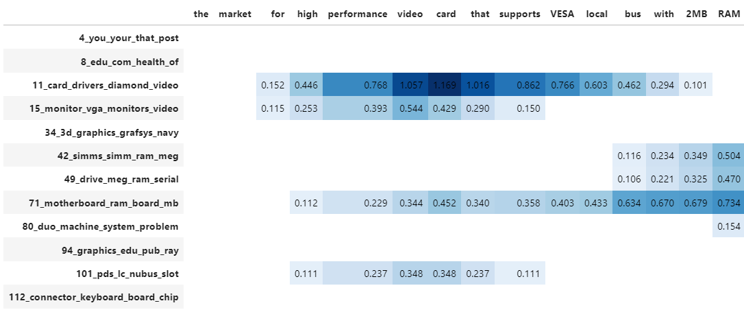
Although a topic distribution is nice, we may want to see how each token contributes to a specific topic. To do so, we need to first calculate topic distributions on a token level and then visualize the results:
# Calculate the topic distributions on a token-level
topic_distr, topic_token_distr = topic_model.approximate_distribution(docs, calculate_tokens=True)

# Visualize the token-level distributions
df = topic_model.visualize_approximate_distribution(docs[1], topic_token_distr[1])
df
Note
To get the stylized dataframe for .visualize_approximate_distribution you will need to have Jinja installed. If you do not have this installed, an unstylized dataframe will be returned instead. You can install Jinja via pip install jinja2
Note
The distribution of the probabilities does not give an indication to the distribution of the frequencies of topics across a document. It merely shows how confident BERTopic is that certain topics can be found in a document.